Data Source
UPDATE: JHU dataset changed its name and format, The data for USA and global are separated. The US data adapted a new format. Some amateur data scientists are in charge of the this project. 04-02-2020
The data source used for this analysis is the 2019 Novel Coronavirus COVID-19 (2019-nCoV) Data Repository1 built the Center for Systems Science and Engineering, Johns Hopkins University (GitHub – CSSEGISandData/COVID-19: Novel Coronavirus (COVID-19) Cases, provided by JHU CSSE). The following is true for global data set.
Field description:
- Province/State: China – province name; US/Canada/Australia/ – city name, state/province name; Others – name of the event (e.g., “Diamond Princess” cruise ship); other countries – blank.
- Country/Region: country/region name conforming to WHO (will be updated).
- Last Update: MM/DD/YYYY HH:mm (24 hour format, in UTC).
- Confirmed: the number of confirmed cases. For Hubei Province: from Feb 13 (GMT +8), we report both clinically diagnosed and lab-confirmed cases. For lab-confirmed cases only (Before Feb 17), please refer to who_covid_19_situation_reports. For Italy, diagnosis standard might be changed since Feb 27 to “slow the growth of new case numbers.” (Source)
- Deaths: the number of deaths.
Recovered: the number of recovered cases.
Time series summary (csse_covid_19_time_series)
This folder contains daily time series summary tables, including confirmed, deaths and recovered. All data are from the daily case report.
Field description:
- Province/State: same as above.
- Country/Region: same as above.
- Lat and Long: a coordinates reference for the user.
- Date fields: M/DD/YYYY (UTC), the same data as MM-DD-YYYY.csv file.
R Packages Needed
|
1 2 3 4 5 6 7 8 |
list.of.packages <- c("ggplot2","lubridate", "tidyverse","magrittr","dplyr","maps","ggmap","mapdata","viridis","ggforce","kableExtra", "gganimate","ggthemes") new.packages <- list.of.packages[!(list.of.packages %in% installed.packages()[,"Package"])] if(length(new.packages)) install.packages(new.packages) eval(parse(text=paste("library(",list.of.packages,")")))####load the needed packages options(digits=3) panderOptions('round', 3) panderOptions('keep.trailing.zeros', TRUE) |
Loading Data (UPDATED)
The data preparation code is shamelessly taken from here.
|
1 2 3 4 5 6 7 8 9 10 11 12 13 14 15 16 17 18 19 20 21 22 23 24 |
# as of 03-26-2010, the dataset changed its format, following code is revised accordingly. # source data files filenames <- c('time_series_covid19_confirmed_global.csv', 'time_series_covid19_deaths_global.csv', 'time_series_covid19_recovered_global.csv', 'time_series_covid19_confirmed_US.csv', 'time_series_covid19_deaths_US.csv') url.path <- 'https://raw.githubusercontent.com/CSSEGISandData/COVID-19/master/csse_covid_19_data/csse_covid_19_time_series' ## download files to local download <- function(filename) { url <- file.path(url.path, filename) dest <- file.path('./data', filename) download.file(url, dest) } bin <- lapply(filenames, download) # load data into R data.confirmed.us<-read.csv('./data/time_series_covid19_confirmed_US.csv') data.deaths.us<-read.csv('./data/time_series_covid19_deaths_US.csv') # data.confirmed <- read.csv('./data/time_series_19-covid-Confirmed.csv') data.deaths.world<-read.csv('./data/time_series_covid19_deaths_global.csv') data.recovered.world<-read.csv('./data/time_series_covid19_recovered_global.csv') data.confirmed.world <- read.csv('./data/time_series_covid19_confirmed_global.csv') data.confirmed.world_orig <- data.confirmed.world |
Each dataset has `r dim(data.confirmed.us)[1]` rows, corresponding to country/region/province/state. It has `r dim(data.confirmed.us)[2]` columns. Starting from column 5, each column corresponds to a single day. Here we draw a random sample of 10 rows and have a look at their first 10 columns.
|
1 2 3 4 5 6 7 |
data_usa <-data.confirmed.us # %>% filter(Country.Region=='US') # data.confirmed.orig <- data.confirmed data.confirmed.us [,1:10] %>% sample_n(10) # %>% # kable("latex", booktabs=T, caption="Raw Data (Confirmed, First 10 Columns only)") %>% # kable_styling(font_size=6, latex_options = c("striped", "hold_position", "repeat_header")) |
| 84022059 | US | USA | 840 | 22059 | LaSalle | Louisiana | US | 31.67884782 | -92.15907765 |
| 84016019 | US | USA | 840 | 16019 | Bonneville | Idaho | US | 43.38713372 | -111.6161537 |
| 84032003 | US | USA | 840 | 32003 | Clark | Nevada | US | 36.21458855 | -115.0130241 |
| 84036117 | US | USA | 840 | 36117 | Wayne | New York | US | 43.15494365 | -77.02976528 |
| 84026025 | US | USA | 840 | 26025 | Calhoun | Michigan | US | 42.24633834 | -85.00493569 |
| 84037173 | US | USA | 840 | 37173 | Swain | North Carolina | US | 35.48665845 | -83.48748932 |
| 84048065 | US | USA | 840 | 48065 | Carson | Texas | US | 35.40365929 | -101.3542669 |
| 84049003 | US | USA | 840 | 49003 | Box Elder | Utah | US | 41.52106798 | -113.0832816 |
| 84054089 | US | USA | 840 | 54089 | Summers | West Virginia | US | 37.65390597 | -80.86009693 |
| 84080040 | US | USA | 840 | 80040 | Out of OK | Oklahoma | US | 0 | 0 |
|
1 2 3 4 5 6 7 |
n.col <- ncol(data.confirmed.us) ## get dates from column names dates <- names(data.confirmed.us)[13:n.col] %>% substr(2,8) %>% mdy() range(dates) max.date <- max(dates) min.date <- min(dates) |
|
1 2 3 |
2020-01-23 |
It shows that the data was last updated on 2020-04-02.
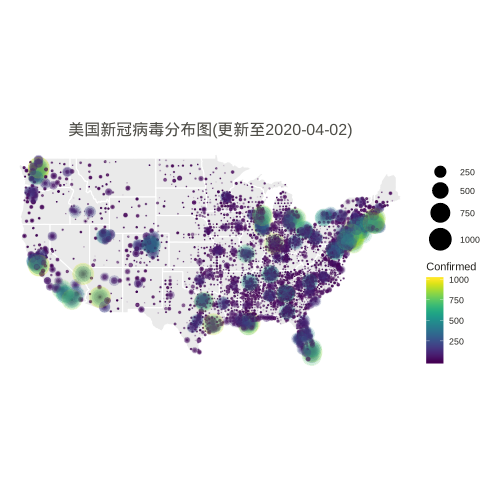
USA State-by-state Map
|
1 2 3 4 5 6 7 8 9 10 11 12 13 14 15 16 17 18 19 20 21 22 23 24 25 26 27 28 29 30 31 32 33 34 35 |
n.col <- ncol(data_usa) # Create breaks for the color scale # mybreaks <- c(2, 10, 40, 100) states <- map_data("state") dt1 <- data_usa %>% select(-c(UID,iso2,iso3,code3,FIPS,Admin2,Country_Region,Combined_Key)) %>% # filter(!str_detect(Province.State, "\\,")) %>% # if want to include city data # mutate(Province.State = toupper(str_sub(Province.State, -2,-1))) %>% mutate_all(~replace(., is.na(.), 0)) %>% filter(Province_State!="C.") %>% gather(Date, Confirmed, -Province_State, -Lat, -Long_) %>% # convert Date column in right format mutate(Date=substr(Date,2,8))%>% mutate(Date=mdy(Date)) %>% # filter(Date<"2020-03-25") %>% filter(Confirmed>0) %>% # remove the 0 from plotting filter(Long_>-130 & Long_<0 & Lat > 20) # focus on mainland USA # usa <- map_data("usa") ggplot() + geom_polygon(data=states, aes(x=long, y=lat, group = group),color="white",alpha=0.1) + geom_point(data=dt1, aes(x=Long_, y=Lat, size =Confirmed, color=Confirmed, alpha =Confirmed)) + scale_size(limits = c(1,1000),range = c(.1,10),guide_legend(title=""))+ scale_alpha_continuous(range=c(0.1,0.9),guide = FALSE) + # turn off legend scale_color_viridis(limits = c(1,1000)) + coord_fixed(1.3) + theme_void() + coord_map() + labs(title=paste0('美国新冠病毒分布图(更新至', max.date, ')')) + guides(fill=FALSE) + # do this to leave off the color legend theme( text = element_text(color = "#22211d"), plot.title = element_text(size= 16, hjust=0.5, color = "#4e4d47", margin = margin(b = 0.1, t = 0.4, l = 2, unit = "cm")), ) + guides(fill=FALSE) # do this to leave off the color legend |
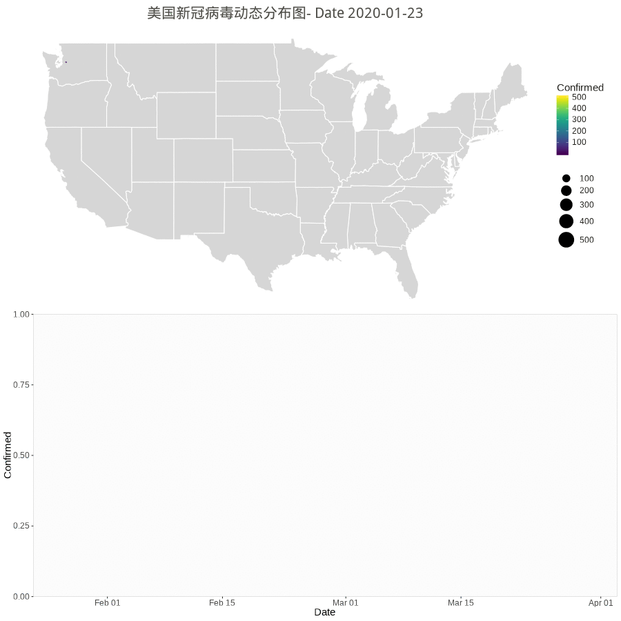
Animation by Day
The gganimate or gapminder package is almost working for a much easy job, but the data set have city/county with duplicate dates. So, the following rendering method used.
However the city/county stopped updating according to Cities and counties statics going dark · Issue #1068 · CSSEGISandData/COVID-19 · GitHub.
starting 3/10/20, they’re only doing the US by states. Province/State is smallest subcategory they go, and only for some countries (dependencies of some nations and provinces/states of US, China, Canada, Australia, I believe).
|
1 2 3 4 5 6 7 8 9 10 11 12 13 14 15 16 17 18 19 20 21 22 23 24 25 26 27 28 29 30 31 32 33 34 35 36 37 38 39 40 41 42 43 44 45 46 47 48 49 50 51 52 53 54 55 56 57 58 59 60 61 62 63 64 65 66 67 68 69 70 71 72 73 74 75 76 77 78 79 80 81 82 83 |
library(gapminder) library(animation) library(patchwork) # library(patchwork) n.col <- ncol(data_usa) # Create breaks for the color scale mybreaks <- c(2, 10, 40, 100) # Get the world polygon and extract US states <- map_data("state") dt1 <- data_usa %>% select(-c(UID,iso2,iso3,code3,FIPS,Admin2,Country_Region,Combined_Key)) %>% # filter(!str_detect(Province.State, "\\,")) %>% # mutate(Province.State = toupper(str_sub(Province_State, -2,-1))) %>% # using city data mutate_all(~replace(., is.na(.), 0)) %>% filter(Province_State!="C.") %>% gather(Date, Confirmed, -Province_State, -Lat, -Long_) %>% # convert Date column in right format mutate(Date=substr(Date,2,8))%>% mutate(Date=mdy(Date)) %>% # filter(Date>"2020-02-01") %>% filter(Confirmed>0) %>% # remove the 0 filter(Long_>-130 & Long_<0 & Lat > 20) #remove outlier in long and lat usa <- map_data("usa") ani.options( convert = shQuote('C:/Program Files (x86)/ImageMagick-6.8.1-Q16/convert.exe') ) saveGIF( { start_date <- min.date while (start_date <= max.date) { dt <- dt1 %>% filter(Date <= start_date) p1 <- ggplot() + geom_polygon(data=states, aes(x=long, y=lat, group = group),color="white",alpha=0.2) +coord_fixed(1.5)+ geom_point(data=dt, aes(x=Long_, y=Lat, size =Confirmed, color=Confirmed, alpha =Confirmed)) + scale_size(limits = c(1,500),range = c(.5,10),guide_legend(title=""))+ scale_alpha_continuous(range=c(0.2,0.4),guide = FALSE) + # turn off legend scale_color_viridis(limits = c(1,500)) + coord_fixed(1.3) + theme_void() + coord_map() + labs(title=paste0('美国新冠病毒动态分布图- Date ', start_date)) + guides(fill=FALSE) + # do this to leave off the color legend theme( text = element_text(color = "#22211d"), plot.title = element_text(size= 16, hjust=0.5, color = "#4e4d47", margin = margin(b = 0.1, t = 0.4, l = 2, unit = "cm")), ) + guides(fill=FALSE) # do this to leave off the color legend dt %>% group_by(Date) %>% summarise(Confirmed = sum(Confirmed)) %>% ungroup() p2 <- ggplot(dt, aes(x = Date, y = Confirmed)) + geom_col() + scale_fill_manual(values = c("#b2d1e0","gold")) + scale_x_date(limits = c(as.Date(min.date), as.Date(max.date+1)), expand = c(0,0)) + scale_y_continuous(expand = c(0,0)) + labs(x = "Date", y = "Confirmed") + theme(legend.position = "none", panel.grid.major = element_blank(), panel.grid.minor = element_blank(), panel.background = element_rect(fill = "grey99", colour = "grey80"), plot.title = element_text(hjust = 0.5)) start_date <- start_date + 1 # plot(p3) # Print plots using patchwork grid.arrange(p1, p2, ncol=1) # print(p1 + p2 + plot_layout(ncol = 1, heights = c(5, 1))) } }, movie.name = "anim.gif", interval = 1, ani.width = 900, ani.height = 900, outdir = getwd() ) |
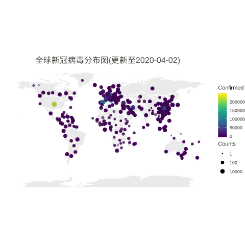
Worldwide
|
1 2 3 4 5 6 7 8 9 10 11 12 13 14 15 16 17 18 19 20 21 22 23 24 25 26 27 28 29 30 31 32 33 34 35 |
# data preparation data_world <- data.confirmed.world_orig %>% rename(Province = 'Province.State', Country = 'Country.Region') %>% gather(Date, Confirmed, -Province, -Country, -Lat, -Long) %>% mutate(Country = case_when(Country %in% c("Mainland China", "Macau", "Hong Kong SAR", "Taipei and environs") ~ "China", Country == "US" ~ "United States", Country == "UK" ~ "United Kingdom", TRUE ~ as.character(Country))) %>% # Reorder data to show biggest cities on top arrange(Country) %>% mutate(Country=factor(Country,unique(Country))) %>% filter(Long>-150) world_map <- map_data("world") ggplot() + geom_polygon(data=world_map, aes(x=long, y=lat, group = group),color="white",alpha=0.1) +coord_fixed(1.3) + geom_point(data=data_world, aes(x=Long, y=Lat, size =Confirmed, color=Confirmed,alpha=Confirmed )) + scale_size(limits = c(1,800000),trans="log10",range = c(.5,4),guide_legend(title=""))+ scale_alpha_continuous(range=c(0.1,0.4),guide = FALSE) + # turn off legend scale_color_viridis(limits = c(1,5000000)) + # scale_size_continuous(name="Counts", trans="log2", range=c(.5,5), breaks=mybreaks) + # scale_alpha_continuous(name="Counts", range=c(0.2, .5), breaks=mybreaks) + # scale_color_viridis(option="magma", name="Counts" ) + guides(size=guide_legend("Counts")) + scale_color_viridis() + coord_fixed(1.3) + theme_void() + labs(title=paste0('全球新冠病毒分布图(更新至', max.date, ')')) + guides(fill=FALSE) + # do this to leave off the color legend theme( text = element_text(color = "#22211d"), plot.title = element_text(size= 16, hjust=0.5, color = "#4e4d47", margin = margin(b = 0.1, t = 0.4, l = 2, unit = "cm")), ) |
MAR
About the Author:
Beyond 8 hours - Computer, Sports, Family...